App Design · Branding
Travel App Design
Meanderfile
Student work
Brief
Develop a design proposal for a creative digital media artefact before designing, creating and testing the product.
My contribution
We were able to choose our own theme and artefact, so I combined two things I care about: app design and travel, and built a handy travel organisation app. I mixed research with what I already knew about both, and started brainstorming a name, a few logo sketches, and basic wireframes for the app itself.
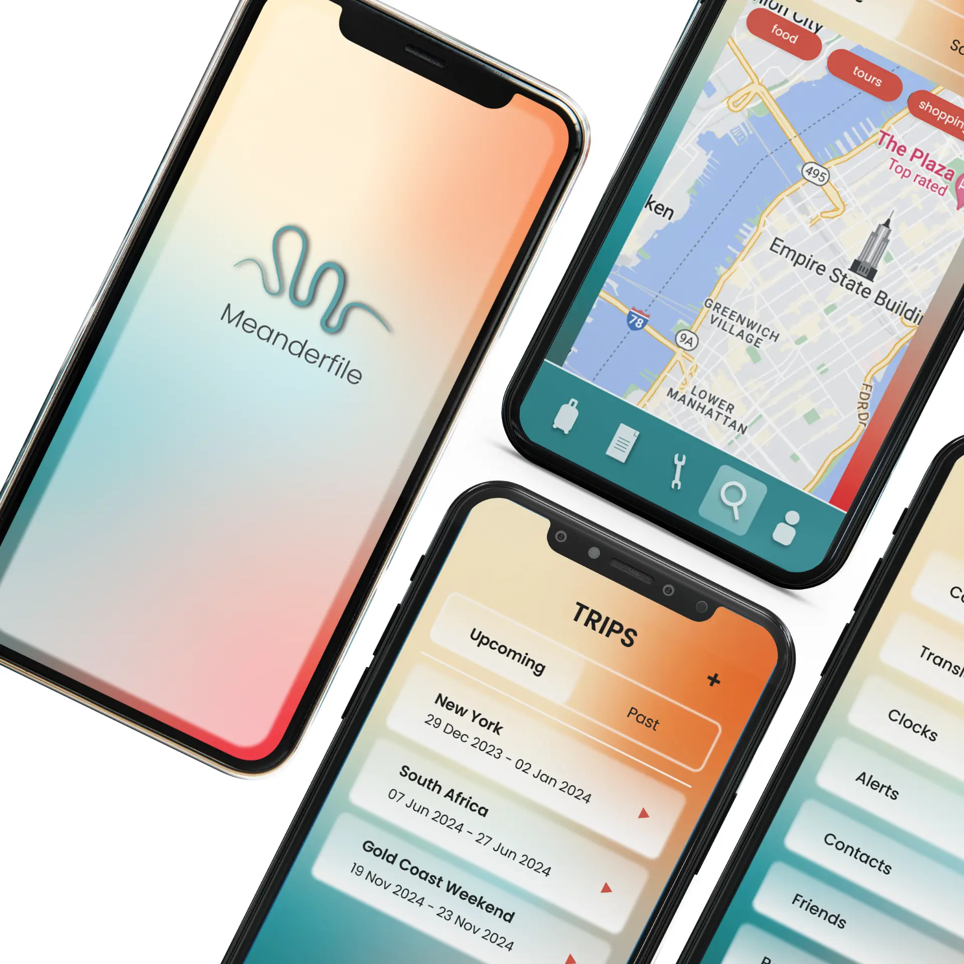
The name Meanderfile was generated from the words 'meander' (wander at random), and 'file' (a place to store things) to create originality and meaning. The logo design shows a meandering river or path which could also be visualised loosely as an 'M'. It is modern and simple to stand the test of time.
As for the colour scheme, I wanted to symbolise both the coast and the land while creating feelings of excitement, confidence, adventure, and relaxation all at once.
Throughout the development of the medium-fidelity wireframes, feedback from the teaching team and my peers turned out to be genuinely useful and really pushed the design one step further than I would have taken it alone. I incorporated the glass-morphism trend that has been used for several years, with projections to still be popular in the future.
Click through the prototype